
VOronoi and Delaunay Triangulations
in R
|
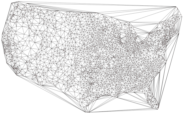
This image created in R uses Voronoi mapping to plot the locations of every airport in the USA. The borders of every triangle show the area that is closer to that point than any other. Essentially, it is an illustration of an optimization problem. In this case it tells the viewers what the closest airport to them would be.
|
using google maps with r
|
|
This image created in R uses the ggmap and mapproj libraries in R to interface with Google Maps.
Useful links: https://journal.r-project.org/archive/2013-1/kahle-wickham.pdf http://www.milanor.net/blog/maps-in-r-introduction-drawing-the-map-of-europe/ |

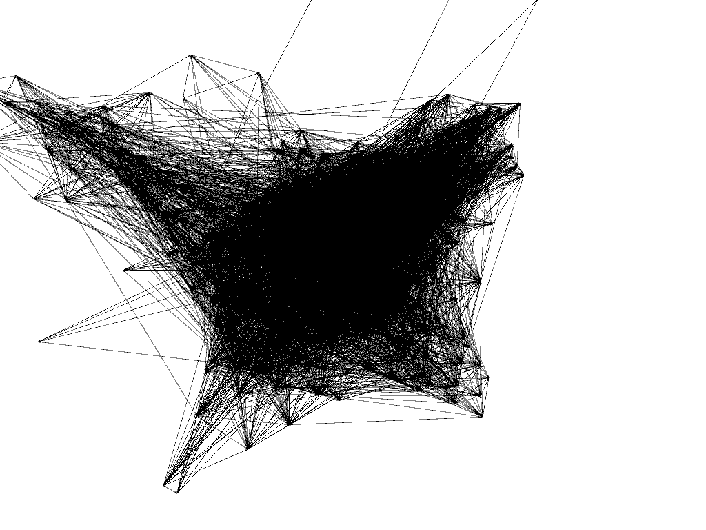
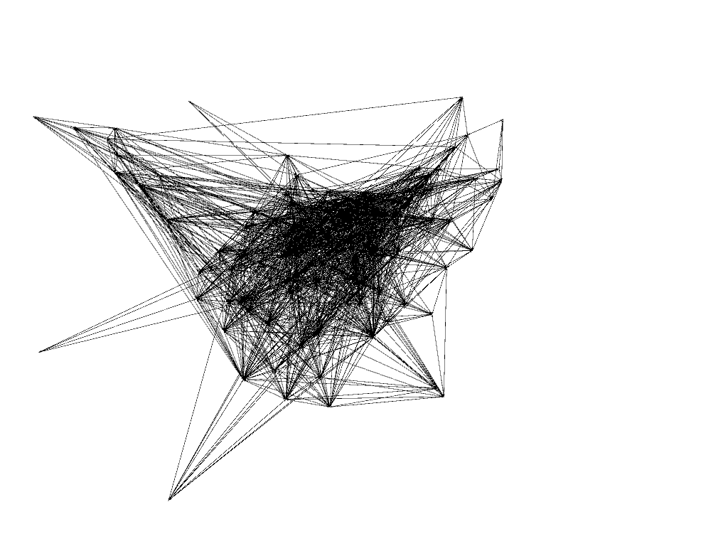
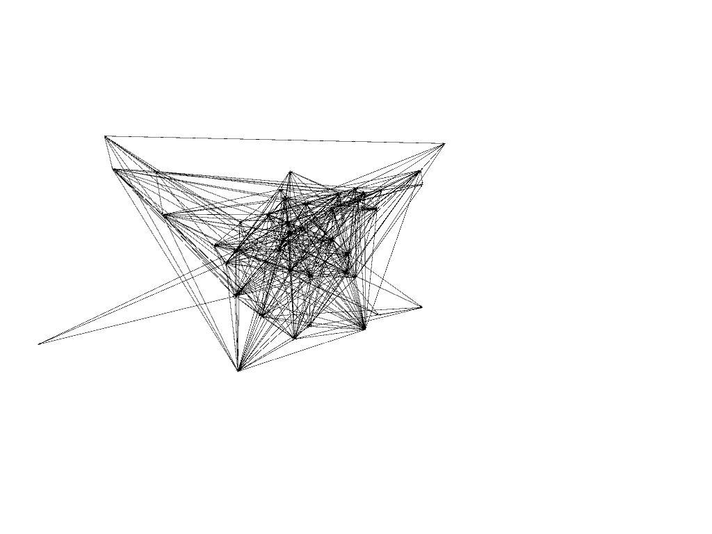
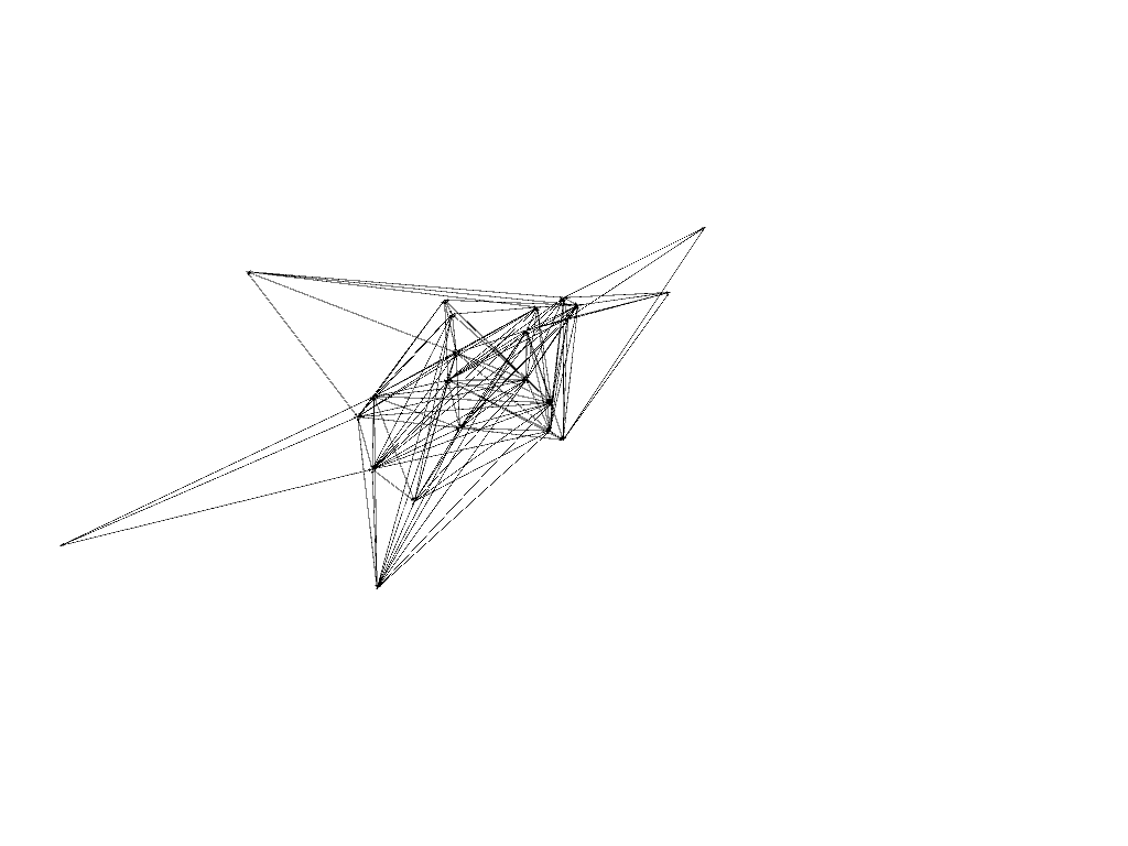
NEtwork visualization #1
First experiments with processing large amounts of network data.
These are the Enron emails visualized. Each node represents a person; each line represents an email between people; thicker lines mean more emails.
Images start by showing all nodes and progress to showing only the most important, most connected nodes.
These are the Enron emails visualized. Each node represents a person; each line represents an email between people; thicker lines mean more emails.
Images start by showing all nodes and progress to showing only the most important, most connected nodes.
|
|
|
|
Images were created using the software Gephi and data from the Stanford Large Network Dataset Collection; data was organized through MS Excel. The render process/algorithm used is YifanHu, which is a force directed model. Each node is treated as a mass and each edge as a spring, so more important points move to the center.
Nodes have been manipulated to avoid overlap.
Nodes have been manipulated to avoid overlap.
Evolution of a Data Visualization

|

